Cornerstone Theme Manual
Cornerstone is a free theme designed by BigCommerce and is available to all stores. It is fully responsive, meaning it automatically adapts to the device it is being viewed on (desktop, tablet, or mobile), and has built-in features to help you sell, like a homepage carousel (slideshow), social media icons, featured, top-selling, and new product panels, and support for product filtering (faceted search).
The theme has a simple and clean design that can be easily customized to match your business or brand using the Page Builder.
Cornerstone Theme Features
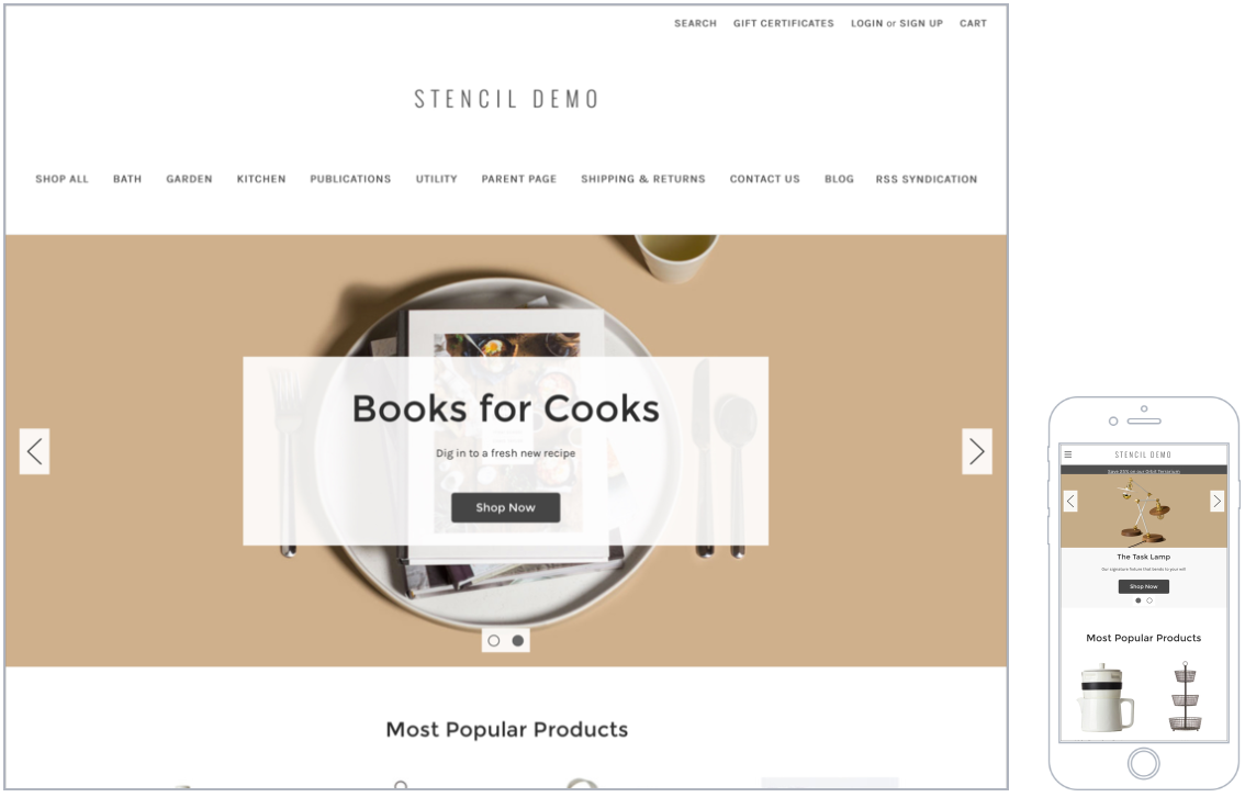
The Cornerstone theme comes with three style variations that are each fully responsive and ideal for a large catalog. The theme utilizes a top navigation and buttons with rounded corners.
For Carousel slide images, we support JPEG, GIF, and PNG file types, but recommend using JPEG files for product images to ensure a balance between image quality and fast loading time. We also recommend using slide images approximately 1400 x 600 pixels or 1400 x 800 pixels. All slide images should have consistent dimensions.
You can resize your store product images by adjusting the product card dimensions in Page Builder. When you are resizing your images, it is best to keep them all the same aspect ratio. For more information, see our guides on Troubleshooting Your Store Images and Adjusting Your Store Image Settings.
Updates and customer support for the Cornerstone theme are provided for free. However, BigCommerce technical support is unable to directly assist with editing code like HTML or CSS. See the BigCommerce Design Policy for more information.
Localized Store Experiences: This feature is available for all of our supported languages. For more information on the default language store setting, see Store Profile Settings.
Release Notes
As the default theme on new stores, Cornerstone is typically the first theme to support new theme-related features and improvements.
See the Dev Center Updates for the latest Cornerstone release notes.
Page Builder
Themes can be customized on the Theme Styles tab in Page Builder. You can customize attributes like color, font, and text size as well as design elements like the header, logo, navigation, and product panels.
The various areas that can be customized or enabled and disabled are listed below.
Global
| Background and lines | |
| Banner background | background color that appears behind text on a banner |
| Page background | background color of the overall site. It does not change the color of the header or footer backgrounds |
| Common dark background | background color common of overlays such as the button blocks on the Add to Cart popup |
| Modal overlay background | background color when a modal window is active, such as when a shopper adds a product to the cart or uses Quick View |
| Alert popup box background color | background color of popup messages and alerts |
| Alert popup text color | color of the text in popup messages and alerts |
| Horizontal line | color of lines that divide areas such as the header, footer, and product description |
| Body text and links | |
| Body text font family | font face to use for body text |
| Body text font size | font size to use for body text |
| Body text color | color of body text |
| Body text hover color | color of text, such as Logo Text, when a cursor hovers over it |
| Secondary text color | color of text used as subtitles, such as links in the footer, product prices on the home page, and category breadcrumbs |
| Secondary text hover color | color of text such as the text in the footer when a cursor hovers over it |
| Link color | color of hyperlinks created on webpages |
| Link hover color | color displayed when a cursor hovers over a link |
| Link active color | color that displays when a user clicks a link. This may display quickly and may not appear at all on some browsers. |
| Headings | |
| Heading font family | font face to use for all headings |
| Heading 1 | size of large titles, such as the title of a Category or the Featured Product section on the home page |
| Heading 2 | size of h2 headings, such as the price on a product’s page |
| Heading 3 | size of h3 headings, such as heading text on blog pages |
| Heading 4 | size of h4 text, such as heading text within a web page or product description |
| Heading 5 | size of h5 text, such as product names on the home page, top navigation, Carousel button text, and product tabs |
| Heading 6 | size of h6 text, such as the titles of options, custom fields, and product card buttons |
| Heading text color | color of all headings |
| Loading Indicators | |
| Page loading bar | color of the loading bar |
| Spinner light half | color of the empty portion of the spinner |
| Spinner dark half | color of the filled portion of the spinner |
| Modal loading background | color of the loading overlay |
| Product thumbnail loading background | background color of a thumbnail, also appears while a thumbnail image loads |
| Image Loading | |
| Lazyloading Mode | how images load before the user scrolls to them on the screen |
| Pages | |
| Hide breadcrumbs | removes breadcrumbs on product and category pages |
| Hide page heading | removes the title on web pages |
| Hide category page heading | removes the category name heading from category pages |
| Hide blog page heading | removes the title of the blog page |
| Hide contact us page heading | removes the title of the contact us page |
| Products | |
| Display style | select to display in a grid or a list |
| Blog | |
| Size of images | size of images on blog pages |
| Pricing | |
| Price Ranges | show the range of prices for products with variants |
| Form input fields | |
| Label text color | color of the form labels that appear above text boxes or product option selections |
| Field text color | color of text that appears inside a text box or drop-down menu |
| Field background | background color of a dropdown menu or text box |
| Field background disabled | color of a choice when it’s not selectable |
| Field border | color of the border around dropdown menus, text boxes, and rectangle multiple-choice buttons |
| Field border active | color of the border around dropdown menus, text boxes, and rectangle multiple-choice buttons when you click to enter text or make a choice |
Home Page
| Carousel | |
| Show carousel | toggles the carousel on or off |
| Show carousel arrows | toggles the left and right arrows on or off |
| Show carousel Play/Pause button | toggles the Play/Pause button on or off |
| Allow image to stretch on large screens | prevents cropping of large carousel images if the viewing screen is wider than 1261 pixels |
| Content background | background color of the box overlay on the Carousel |
| Header text | color of the large text on the Carousel |
| Description text | color of the smaller text on the Carousel |
| Indicator | color of the empty dot below the Carousel if there is more than one slide |
| Indicator active | color of the full dot below the Carousel if there is more than one slide |
| Indicator background | background color of the box below the carousel if there is more than one slide |
| Arrow | color of the left and right arrows if there is more than one slide |
| Arrow background | background color of the box behind the arrows if there is more than one slide |
| Arrow border | color of the border of the box behind the arrows if there is more than one slide |
| Play/Pause button text | background color of the Play/Pause button text if there is more than one slide |
| Play/Pause button background | color of the box behind the Play/Pause button if there is more than one slide |
| Play/Pause button border | color of the border of the box behind the Play/Pause button if there is more than one slide |
| Products | |
| Number of Featured Products | number of featured products to display on the home page, or disable this feature |
| Number of Most Popular Products | number of most popular products to display on the home page, or disable this feature |
| Number of New Products | number of new products to display on the home page, or disable this feature |
Products
| Product sale badges | |
| Show product sale badges | display style of sale badges or select None to disable. Disabling product sale badges will hide the label and badge settings below in Page Builder |
| Product sale badge label | text on the sale badge |
| Product price label (sale) | Sale Price text |
| Product price label (before sale) | Default Price text |
| Product price label (retail) | MSRP price text |
| Product price label | price label text when there is no sale price |
| Badge text color | color of the text on the sale badge |
| Badge color | background color of the sale badge |
| Badge hover color | color of the sale badge when a cursor hovers over it |
| Show product sold-out badges | display style of the sold-out badge or select None to disable. Disabling product sold-out badges will hide the label and badge settings below in Page Builder |
| Product sold-out badge label | text on the sold-out badge |
| Badge text color | color of the text on the sold-out badge |
| Badge color | background color of the sold-out badge |
| Badge hover color | color of the sold-out badge when a cursor hovers over it |
| Display settings | |
| Show quickview button on product cards | toggles the feature |
| Show product description tabs | displays product descriptions under a tabbed area or directly on the page |
| Product custom fields in tabs | displays product custom fields under a tabbed area or directly on the page. This option must be checked in order to see the Product custom fields tab label setting in Page Builder |
| Product custom fields tab label | changes the text of the custom fields tab |
| Show product weight | toggles the display of the product's entered shipping weight |
| Show product dimensions | toggles the display of the shipping dimensions for the product |
| Show product swatch names | toggles the display of selected swatch names |
| Show “Shop by price” in filters | toggles the shop by price filter |
| Show product reviews | toggles reviews on product pages. This option must be checked in order to see the Number of product reviews setting in Page Builder. |
| Number of product reviews | number of reviews to display per page |
| Wishlist dropdown background | background color of the drop-down menu when Add to Wish List is clicked |
| Show quick payment buttons |
toggles payment buttons for digital wallets enabled with your payment gateways. The following digital wallets are supported:
|
| Number of products displayed | |
| Category page | number of products that appear on one page in a category |
| Brand page | number of products that appear on one page on a brand page |
| Search result page | number of products that appear on one page of search results |
| Product page (related products) | number of related products displayed below the product description, or disable this feature |
| Product page (customers also viewed products) | number of Customers Also Viewed products displayed below the product description, or disable this feature |
| Product cards | |
| Product header text color | color of the product’s title when viewed on the home page, category page, or search result |
| Product header text hover color | color of the product's title when you hover a cursor over it |
| Button text color | text color of the buttons, such as Add to Cart or Quick View, that appear when you hover over the product image |
| Button background | background color of the buttons, such as Add to Cart or Quick View, that appear when you hover over the product image |
| Product cards (quick search) | |
| Background color | background color of box behind product text on quick search drop-down |
| Border color | color of the border around the product |
| Text hover color | color of the text when the cursor hovers over the product card |
| Image sizes | |
| Main product images | size of the main product image on a product’s page. See our guide on Adjusting Your Store Image Settings for more information on adjusting product image sizes |
| Thumbnail image in product page | size of the thumbnails under the main product image for products with more than one image |
| Thumbnail image in cart and other pages | size of the thumbnail images that appear in the cart |
| Zoomed image | size of the zoomed product image when a cursor hovers over it |
| Image in gallery view | size of product images when they appear on the category page, brand page, or search results |
| Brand image in gallery view | size of the brand image when viewed on the brands page |
| Product swatch images | size for swatch options images |
Buttons & Icons
| Primary action button | |
| Button text color | color of the text inside the button |
| Button text hover color | color of the text in the button when you hover a cursor over it |
| Button text active color | color of the text in the button when you click on it |
| Button background | background color of the button |
| Button background hover | background color of the button when you hover a cursor over it |
| Button background active | background color of the button when you click on it |
| Secondary action button | |
| Button text color | color of the text inside the button |
| Button text hover color | color of the text in the button when you hover a cursor over it |
| Button text active color | color of the text in the button when you click on it |
| Button border | color of the border around the button |
| Button border hover | color of the border around the button when you hover a cursor over it |
| Button border active | color of the border around the button when you click on it |
| Tertiary action button | |
| Button background | background color of the “sort by” filter drop-down |
| Button arrow icon | color of the arrow in the “sort by” filter drop-down |
| Disabled button | |
| Button text color | color of the text inside a disabled button |
| Button background | background color of the button |
| Button border | color of the border around the button |
| Icons | |
| Social media icon | color of social media icons in the footer |
| Social media icon hover | color displayed when the cursor hovers over a social media icon |
| Star review icon (full) | color of the star icon rating that gets counted |
| Star review icon (empty) | color of the star icons that are empty in a star rating display |
| Increase/decrease button icon | color of the quantity change buttons |
| Checkboxes and radio buttons | |
| Checkbox and radio icon | color of the checkmark on checkboxes, or the dot on radio buttons |
| Button background | background color of the box behind a check mark or radio dot |
| Button border | color of the border around a checkbox or radio button |
Checkout Page
In order to see Checkout settings in Page Builder, you will need to enable Optimized One-Page Checkout on your store.
| Header | |
| Use background image | toggle to upload an image to display behind the logo. Recommended dimensions are 1000 x 400 pixels. This option must be checked and an image uploaded in order to see the Header image size setting in Page Builder. |
| Header image size | size of the background image behind the logo |
| Background color | background color that appears behind the logo |
| Header text color | color of header text if using a text logo |
| Header border | color of the border around the header |
| Logo | |
| Logo type | adds an image for your logo. By default, it will inherit the settings from Header & Footer › Logo. If a unique logo image is chosen, you can select the size. Optimized for theme sets the log to 250 x 100 pixels. |
| Logo position | aligns the logo along the header. Affects both image and text logos. |
| Discount banner | |
| Banner background | background color of Automatic Promotion notifications |
| Banner text color | color of the text in Automatic Promotion notifications |
| Banner icon | color of the icon that appears in Automatic Promotion notifications |
| Order summary box | |
| Box background | background color of the order summary box |
| Box border | color of the border around the order summary box |
| Checkout steps | |
| Icon background | background color of the circle behind the icon |
| Icon border | color of the border of the circle around the icon |
| Icon text color | color of the icon in the step |
| Headings | |
| Heading 1 font family | font face for h1 text |
| Heading 1 text color | color of h1 text |
| Heading 2 font family | font face for h2 text |
| Heading 2 text color | color of h2 text |
| Body | |
| Page background | background color of the page |
| Focus color | color of the selected field on the checkout form |
| Body text and links | |
| Body text font family | font face for the text that appears on the checkout page |
| Body text color | color of the text that appears on the checkout page |
| Secondary text font family | font face of text that is not a title, label or informational text |
| Secondary text color | color of text that is not a title, label or informational text |
| Link font family | font face for text links that appear on the checkout page |
| Link color | color for text links that appear on the checkout page |
| Link hover color | color of text links when you hover a cursor over it |
| Primary action button | |
| Button text font family | font face for buttons |
| Button text color | color of the text inside these buttons |
| Button text hover color | color of the text in the button when you hover a cursor over it |
| Button text active color | color of the text when the button is clicked. This usually displays very quickly, and may not appear in all browsers |
| Button text disabled color | color of the text when the button is disabled |
| Button background | background color of the button |
| Button background hover | background color of the button when you hover a cursor over it |
| Button background active | background color of the button when you click on it |
| Button background disabled | background color of the button when it is disabled |
| Button border | color of the border around the button |
| Button border hover | color of the border around the button when you hover a cursor over it |
| Button border active | color of the border around the button when you click on it |
| Button border disabled | color of the border around the button when it is disabled |
| Secondary action button | |
| Button text font family | font face for buttons |
| Button text color | color of the text inside these buttons |
| Button text hover color | color of the text in the button when you hover a cursor over it |
| Button text active color | color of the text when the button is clicked. This usually displays very quickly, and may not appear in all browsers |
| Button background | background color of the button |
| Button background hover | background color of the button when you hover a cursor over it |
| Button background active | background color of the button when you click on it |
| Button border | color of the border around the button |
| Button border hover | color of the border around the button when you hover a cursor over it |
| Button border active | color of the border around the button when you click on it |
| Form input fields | |
| Label text color | color of the form labels that appear above text boxes or product option selections |
| Field text color | color of text that appears inside a text box or drop-down menu |
| Field placeholder text color | color of example text that appears inside a text box or drop-down menu before the user starts typing |
| Field error text color | color of the error label text when a user attempt to submit the form without completing all required fields |
| Field background | background color of a drop-down menu or text box |
| Field inner shadow | color of the shadow next to the field border |
| Field border | color of the border around drop down menus, text boxes and rectangle multiple-choice buttons |
| Checkbox button background | background color of checkboxes and payment method indicator |
| Form checklist | |
| Background color | background color for payment methods |
| Form background | background color of the selected payment method |
| Form header text color | color of payment method name text (if not a logo) |
| Form border color | color of the borders around payment methods |
| Loading toaster | |
| Toaster background | background color on the loading notification |
| Toaster text color | color of the text on the loading notification |
Payment Buttons
Payment buttons are a feature of digital wallets that enhance your storefront checkout experience by allowing shoppers to place an order from product detail pages or in the cart. Unless otherwise indicated, these settings apply to PayPal Checkout, PayPal Pay Later, and Venmo payment buttons.
| Product Details Page | |
| PayPal button color | color of the PayPal Checkout button on product pages |
| PayPal Pay Later button color | color of the PayPal Pay Later button on product pages |
| Venmo button color | color of the Venmo button on product pages |
| Button content | text that appears inside the PayPal Checkout button on product pages |
| Cart page & Added to Cart modal window | |
| PayPal button color | color of the PayPal Checkout button on the cart page and in the Quick Cart modal |
| PayPal Pay Later button color | color of the PayPal Pay Later button on the cart page and in the Quick Cart modal |
| Venmo button color | color of the Venmo button on the cart page and in the Quick Cart modal |
| Button content | text that appears inside the PayPal Checkout button on the cart page and in the Quick Cart modal |
| Top of Checkout | |
| PayPal button color | color of the PayPal Checkout button at the top of the checkout page |
| PayPal Pay Later button color | color of the PayPal Pay Later button at the top of the checkout page |
| Venmo button color | color of the Venmo button at the top of the checkout page |
| Button content | text that appears inside the PayPal Checkout button at the top of the checkout page |
| Checkout Payment Step (Complete order button) | |
| PayPal button color | color of the PayPal Checkout button at the Payment step of checkout |
| PayPal Pay Later button color | color of the PayPal Pay Later button at the Payment step of checkout |
| Venmo button color | color of the Venmo button at the Payment step of checkout |
| Button content | text that appears inside the PayPal Checkout button at the Payment step of checkout |
| Button size | size of payment buttons at the Payment step of checkout |
| Buttons Container Size | |
| Button Container | size of PayPal Checkout and PayPal Pay Later buttons on product pages, the cart page, and in the Quick Cart modal |
| Quick payment buttons on product page | |
| Number of buttons always visible | requires Quick payment buttons enabled in Cornerstone's Products settings. Displays either one or two payment buttons below the "Add to cart" button on product pages. Any additional buttons will appear in the More payment options modal below the payment buttons. |
| Sort order | specify the display order by dragging and dropping the available buttons in the menu |
| Google Pay Button | |
| Button color | color of the Google Pay button |
| Apple Pay Button | |
| Button color | color of the Apple Pay button |
| Amazon Button | |
| Button color | color of the Amazon Pay button |
| Bolt button | |
| Button shape | shape of Bolt button |
Payment Banners
The settings listed below are for styling the promotional banners available with PayPal Pay Later. You will need to enable Pay Later Messaging in the BigCommerce control panel if you are using PayPal or PayPal powered by Braintree.
| Product page banner | |
| Banner style color | background color of the banner |
| Banner style ratio | banner aspect ratio |
| Home page banner | |
| Banner style color | background color of the banner |
| Banner style ratio | banner aspect ratio |
| Cart page banner | |
| Button text style color | color of the banner text |
| Banner style logo position | position of the PayPal logo in the banner |
| Banner style logo type | style of the PayPal logo in the banner |
Changes to banner appearance do not take effect immediately after publishing. You must go to the settings tab for your payment gateway (PayPal Powered by Braintree or PayPal) in the control panel, then disable and re-enable Pay Later Messaging in order to see the changes in your store.
FAQ
Why doesn't the Payment Buttons section appear in Page Builder?
For Payment Buttons to display in Page Builder, your store needs:
- Cornerstone 2.6.0 or higher (or other compatible theme)
- Optimized One-Page Checkout enabled
- An affected digital wallet
Why doesn't the Payment Banners section appear in Page Builder?
For Payment Banners to display in Page Builder, your store needs:
- Cornerstone 5.5.0 or higher (or other compatible theme)
- Optimized One-Page Checkout enabled
- Pay Later Messaging enabled via PayPal or PayPal powered by Braintree
Why isn't my storefront displaying the language I chose?
You must be using the latest version of Cornerstone for your language to be displayed on the storefront.
 © Copyright 2003 - 2024 BigCommerce Pty. Ltd. Shopping Cart Software