Page Builder
Page Builder allows you to customize the different style elements of your theme, like colors, text sizes, the number of featured products to show on the homepage, and more. You can use this to tailor your storefront so it more closely reflects your brand.
In addition, you can drag and drop content onto pages, like text blocks, images, videos, banners, carousels, buttons, and blocks of custom HTML. This enables you to showcase your products in a way that is visually rich.
Page Builder provides access to your theme’s template files to allow for advanced template editing. You can restore the original theme’s styles if you want to reset the theme back to its default settings.
Back up your theme customizations. If you’ve previously customized your theme in any way, you should back up those changes before using Page Builder.
Using Page Builder
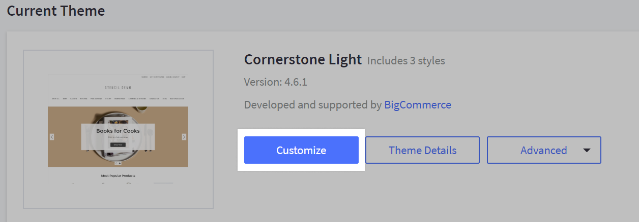
Go to Storefront › Themes › Customize to launch Page Builder.
Using Multi-Storefront? Each storefront's themes are located in the storefront-specific settings within Channel Manager. See Single-Storefront vs. Multi-Storefront for more information.
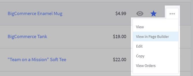
You can also open products, categories, and brands directly by using Action icon and selecting View in Page Builder.
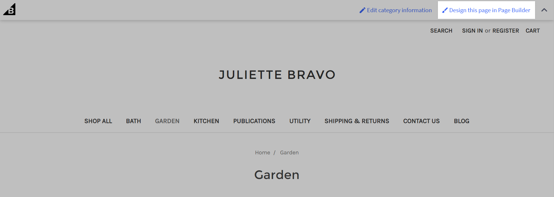
When viewing your storefront while logged in to the control panel, you can use the admin bar at the top of the screen to design the current page in Page Builder. Note that your store needs to be using Cornerstone 4.6.1 or higher (or other updated theme) for the contextual admin bar to appear.
Launch Page Builder in one window! Page Builder does not support multiple user edits at a time. Working in Page Builder simultaneously across multiple devices or browser tabs can cause issues with saving changes to your theme.
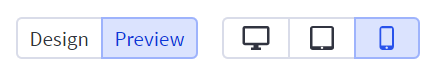
When you launch Page Builder a preview of your store’s live homepage appears on the right, and the theme’s customizable settings appear on the left. Tools to change the preview screen type, save changes, undo changes, and publish the theme are along the top.
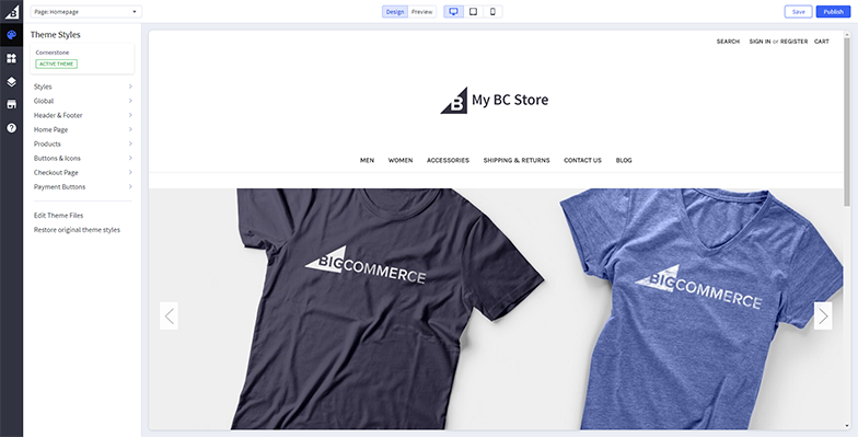
The device icons at the top show you how the page will appear on different devices (desktop, tablet, and phone/mobile). For tablet and phone, click the icon a second time to switch its orientation between vertical and horizontal. Click Preview to collapse the navigation on the left so you can see how your changes will look at full-screen width. While in Preview mode, you can navigate your site just as you would on the storefront, so it’s useful if you want to see how your style changes look on a particular page.
As you make changes, use the buttons in the top right to apply them to your store right away or save them for later.
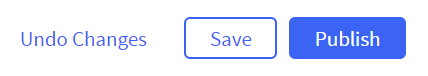
- Save — saves your current changes.
- Publish — publishes the currently saved changes to your live storefront. If you are customizing an Inactive Theme, this will make it the Active Theme.
- Apply Update — appears when you click Customize Update to preview updates to an active theme. Click to apply the update.
- Use as Active Theme — appears when editing an inactive theme before a store has been launched. Click to make it the active theme and publish your changes.
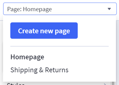
You can create a new web page or jump to an existing web page using the Page dropdown menu in the top left.
You can also find a web page by switching to Preview and navigating to it the same way you would on the storefront. The contextual admin bar can be used to open web pages in Page Builder when navigating the storefront as the store owner (see Using Page Builder).
Along the left edge of the screen are buttons to:
- Return to the Control Panel
- Launch Theme Styles
- Launch Page Builder
- View Layers for the current page (Page Builder)
- View Live Storefront
- Go to Help Center
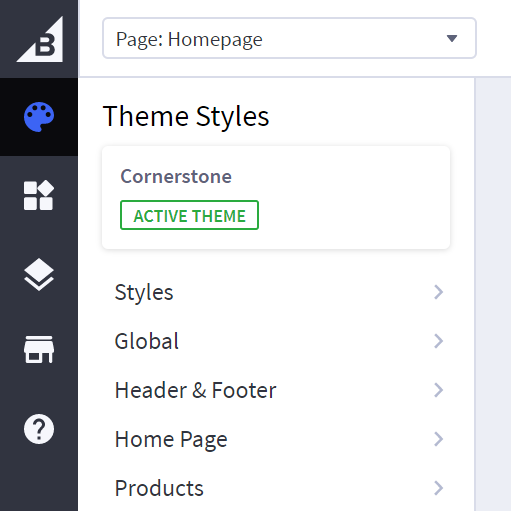
Theme Styles
The Theme Styles menu appears to the left of the preview area when you launch Page Builder. This is where you can customize attributes (like color, font, and text size) of several of your theme’s design elements (like the header, logo, navigation, and footer). You can also turn other design elements off/on.
The theme’s elements are grouped based on where they appear on the storefront (like the homepage or checkout page) or what type of element it is (like a button or icon). The actual sections and their names may differ from theme to theme.
For details about theme styles for our default Cornerstone theme, see the Cornerstone Theme Manual.
For more information about theme styles for themes other than Cornerstone, you’ll need to reference the theme developer’s documentation or contact the developer directly.
Workspace
Windows for theme styles can be dragged around and resized to give you a better look at a particular element. Use the Preview button at the top to collapse the left navigation so you can see the page at full width.
Edit Theme Files
Here you can modify your theme by directly editing its underlying template files.
We do not recommend editing your theme files unless you know what you are doing. See our Stencil developer documentation if you want to learn more.Please note that BigCommerce is unable to offer any support for themes that have been modified with Edit Theme Files.
Restore Original theme styles
Use this to reset the theme styles to their original, default values.
Adding Widgets
The Page Builder lets you easily add content (like text, images, banners, videos, and buttons) to your storefront. We call these blocks of content “widgets”. Widgets can be added to several of your store’s pages, including the homepage, product pages, category pages, brand pages, web pages, blog posts, search results page, and the cart page. Depending on your theme, you may need to update your theme or edit the appropriate template files first.
To add a widget, drag it from the Page Builder menu on the left and drop it into any of the preset regions.
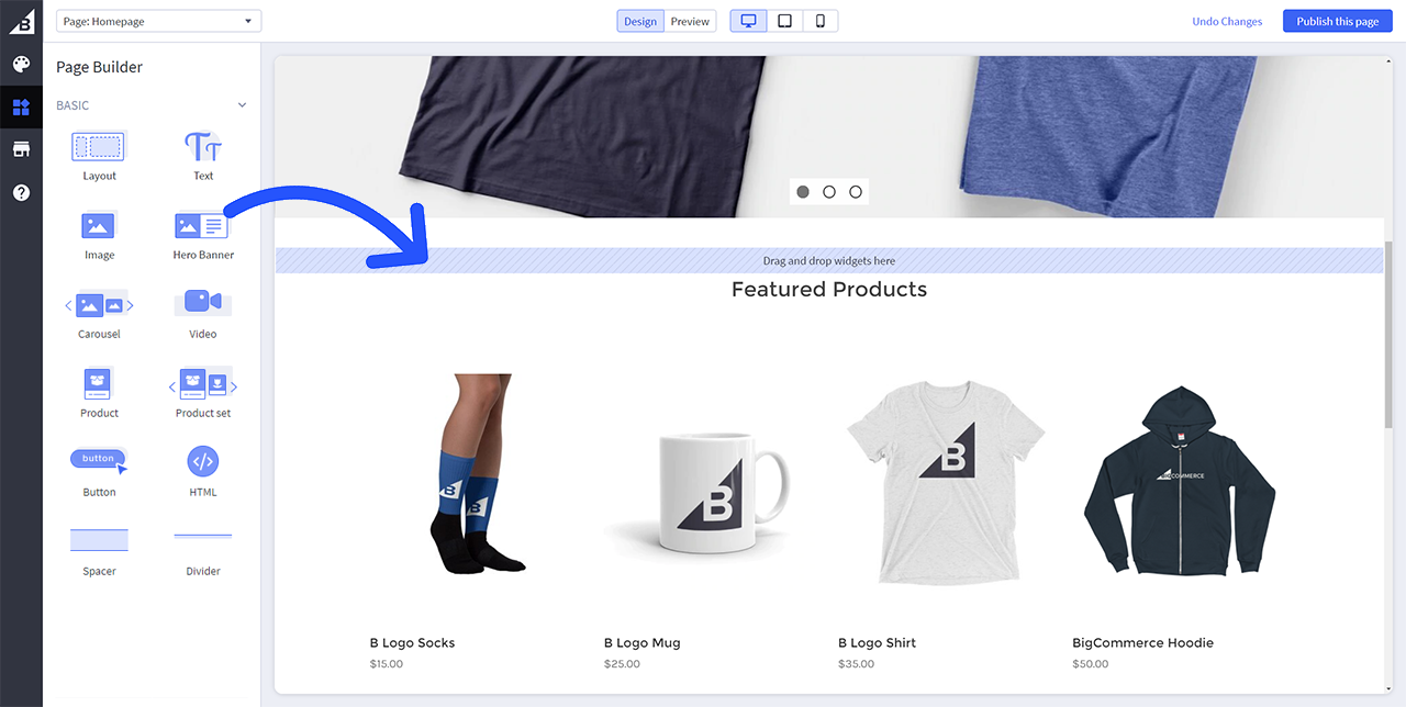
After you drop a new widget on the page, it appears in the Design area on the right, and the Page Builder menu updates to show the widget’s configurable settings. For widgets with text, you’ll edit the text directly on the page. The widget’s available style settings differ based on the type selected.
You can stack additional widgets by dragging them above or below existing widgets.
Did you know? Developers can use Widget Builder to create, edit, and preview custom storefront widgets outside of Page Builder. See the Dev Center for more information on this tool.
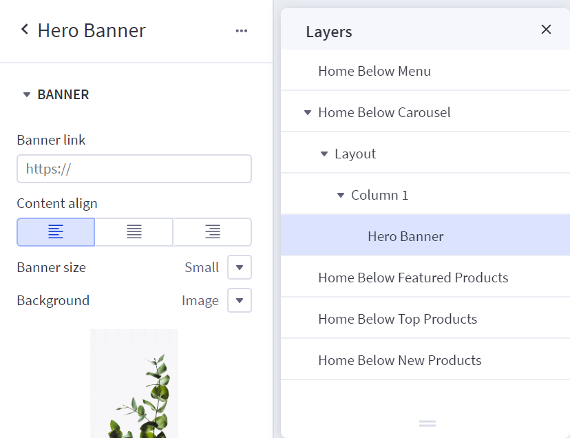
Layers
This tool helps you see how existing widgets are organized on the current page. It lists the titles of all the available widget regions on the page.
- Expanding a region will show any layouts that are in that region.
- Expanding a layout will show the columns in that layout.
- Further expanding the column will show the widgets in that column.
In the Layers menu, you can drag and drop layouts and widgets to change where they are arranged on the page. Clicking an individual layout, column, or widget will bring up its related settings on the left.
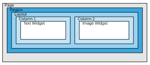
Layout Widget
This widget is used to create a segmented area into which you can place other widgets. For example, if you wanted to arrange 3 images in a row, you would first add a layout widget with 3 columns, then add an image widget to each column. There are separate settings to control the style of the layout as a whole and each individual column.
When you drop other widgets (like an image or banner) on the page, they come already “wrapped” in a layout and column. If you delete a widget, you’ll need to also delete the layout and column associated with it.
Layout
- Name — The widget name is only used internally and doesn’t appear on the storefront. It is used in the Layers nav to help you identify how widgets are arranged on the page.
- Columns — A layout widget can be segmented from 1 to 6 columns.
- Column layout — This allows you to size each column relative to adjacent columns.
- Margin — Margin is the amount of space (in pixels) outside the border of the layout.
- Padding — Padding is the amount of space (in pixels) inside the border of the layout.
Layout Background
- Background — Specify a solid color or image background for the entire layout.
- Image Fit — Fill will resize the image to “fill” the entire area of the layout. Fit will resize the image so that the entire image “fits” within the layout without being cut off.
- Image opacity — Adjust the opacity of your background image. This can create a “translucent” effect.
- Image align — Specify how the background image should horizontally and vertically align within the layout.
Layout Border
- Border style — Select between a solid, dashed, or dotted line border.
- Border color — Select a border color.
- Border thickness — Set the border thickness in pixels.
Columns
You can also adjust the alignment, margin, padding, background, and border style of each individual column in your layout widget. Click a column to bring up its Column menu.
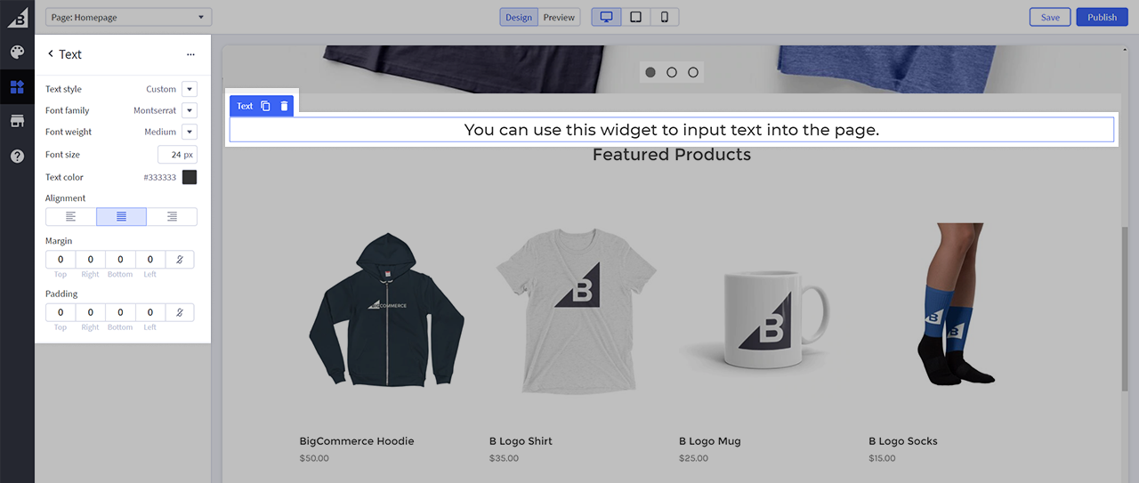
Text Widget
This widget adds a block of text to the page.
- Text style — If set to Custom, you can specify a custom font family, weight, size, and text color of the text for this individual widget. If set to Theme Default, the text will use the default global theme style for body text.
- Alignment — Set the horizontal alignment for the text block.
- Margin — Margin is the amount of space (in pixels) on the outside edge of the text block.
- Padding — Padding is the amount of space (in pixels) on the inside edge of the text block.
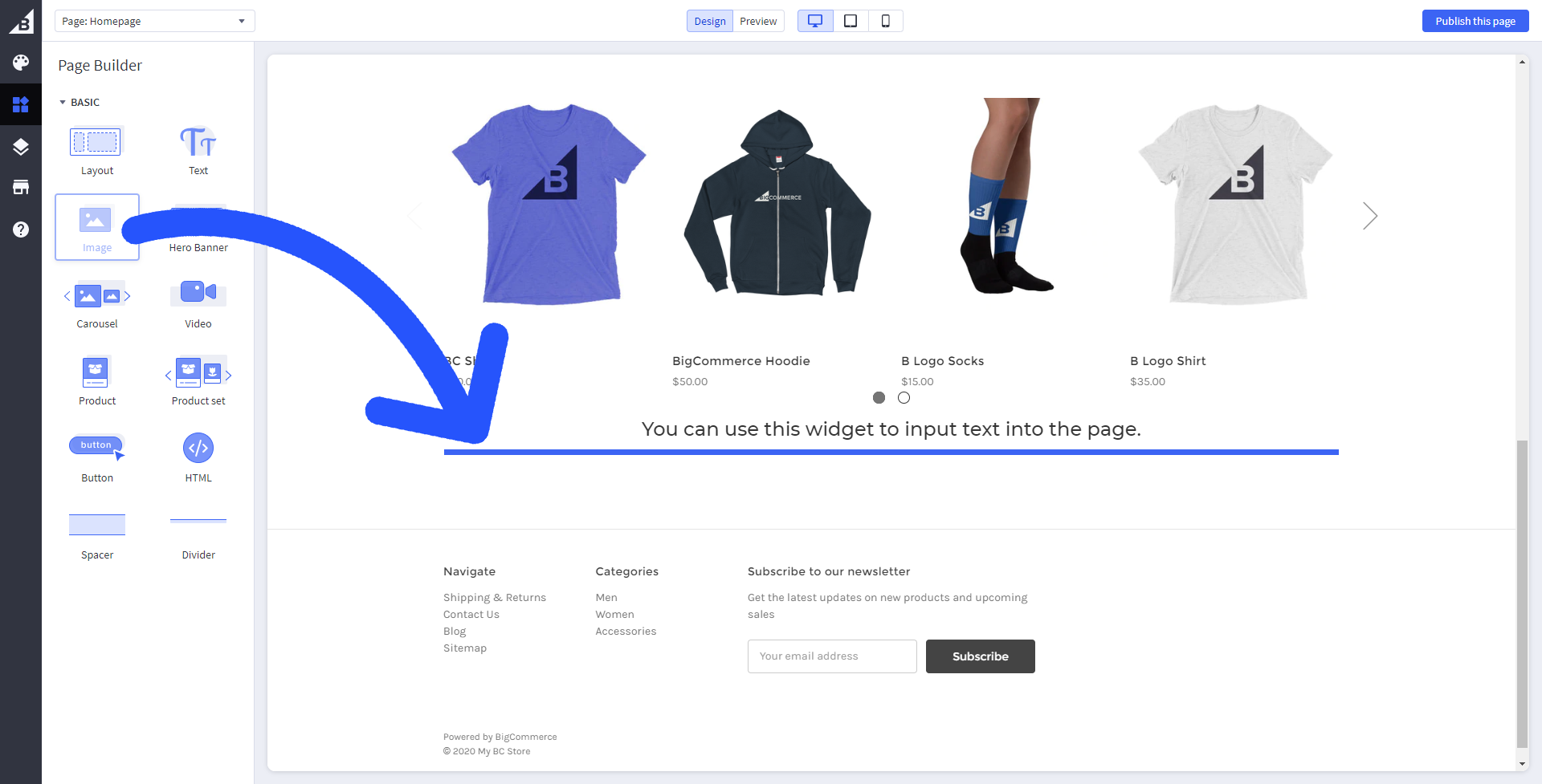
Image Widget
This widget adds an image to the page.
- Upload image — Upload an image from the Image Manager, from your device, or via URL.
- Image link — Select Link to URL if you want the image to link to another page.
- Alt text — Provide alt text for your image for improved accessibility and search optimization.
Image
- Image height — If set to Auto, the widget will size automatically to fit the full size of the image file. If set to Custom, you can specify the image’s maximum height in pixels.
- Image fit — Fill to box will resize the image to “fill” the entire area of the widget. Fit to box will resize the image so that the entire image “fits” within the widget without being cut off.
- Image parallax — This keeps the image position static as a user scrolls up and down the page, creating a “layered” effect. Image fit must be set to Fill to box in order to enable Image parallax.
- Image opacity — Adjust the opacity of your image. This can create a “translucent” effect.
- Image align — Specify how the image should align horizontally and vertically within the widget.
- Margin — Margin is the amount of space (in pixels) outside the border of the image.
- Padding — Padding is the amount of space (in pixels) inside the border of the image.
Image Border
- Normal/Hover — If normal is selected, the image’s border always shows. If Hover is selected, the border only shows when a visitor hovers their mouse over it. This can be used as a visual cue to shoppers that the image is a link / is “clickable”.
- Border color — Specify the image’s border color.
- Border style — Select None, Solid, Dotted, Dashed, Double, Groove, or Ridge.
- Border thickness — Specify the image’s border thickness.
Hero Banner Widget
This widget adds a banner with a configurable background image, title, description, and button.
Banner
- Banner link — Enter the URL (like a product, category, or brand page) this banner should be linked to when clicked.
- Content align — Set the alignment of the title, description, and button.
- Image fit — Fill to box will resize the image to “fill” the entire area of the banner. Fit to box will resize the image so that the entire image “fits” within the banner without being cut off.
- Image parallax — This keeps the background image position static as a user scrolls up and down the page, creating a “layered” effect.
- Image align — Specify how the background image should align horizontally and vertically within the banner.
- Image opacity — Adjust the opacity of the background image. This can create a “translucent” effect.
Text
- Title — Set the visibility of the banner’s title.
- Title style — If set to Custom, you can specify a custom font family, weight, and size of the banner’s title. If set to Theme Default, the title will use the default global theme style.
- Description — Set the visibility of the banner’s description.
- Description style — If set to Custom, you can specify a custom font family, weight, and size of the banner’s description. If set to Theme Default, the description will use the default global theme style.
- Text color — Specify the color of both the title and description text.
- Text color (mobile) — Specify the color of both the title and description text on mobile devices.
Button
- Button — Set the visibility of the banner’s button.
- Button font — If set to Custom, you can specify a custom font family for the banner’s button. If set to Theme Default, the button will use the default global theme style.
- Button style — Select Round, Square, or Pill.
- Button color — Specify the button color.
- Button color (mobile) — Specify the button color on mobile devices.
- Button text color — Specify the button text color.
- Button text color (mobile) — Specify the button text color on mobile devices.
Carousel Widget
This widget adds a carousel (sometimes called a “slideshow”) that allows customers to cycle through multiple different images. This can be a good way to optimize the space available on the page so you can showcase multiple different promotions, categories, products, or brands in a visually interesting way.
Carousel
Here you will define the number of slides your carousel will have and their order.
- Click the plus button + to add a new carousel slide.
- Click the menu button ⋯ to delete or duplicate a slide.
- Click and drag the handle ⋮⋮ next to each slide to change its order.
Slide
Click on each slide under Carousel (see above) to open its configurable settings. You can also cycle through slides using the < and > buttons.
- Title — Enter the text for the top line of text for this slide.
- Description — Enter the text for the middle line of text for this slide.
- Button label & link — Enter the label text and URL for the bottom text link for this slide.
If you don’t want to use a title, description, or button for your slide, leave those fields blank.
Slide | Box
- Image URL — Upload a new image, use an already uploaded image, or specify a image URL for this slide.
- Height (px) — Specify the height of this slide image in pixels.
- Image fit — Fill Container will resize the image to “fill” the entire area of the slide. Fit to Container will resize the image so that the entire image “fits” within the slide area without being cut off.
- Image alignment — Specify how the image should align horizontally and vertically within the slide.
- Margin — Margin is the amount of space (in pixels) outside the border of the image.
- Padding — Padding the amount of space (in pixels) inside the border of the image.
Slide | Title & Subtitle
- Content alignment — Specify how the title, description, and button label should align horizontally and vertically within the slide.
- Font family — Specify the font face for the title and description.
- Font weight — Specify the thickness of the title, description, and button label text.
- Title size — Specify the size of the top title text.
- Subtitle size — Specify the size of the middle description text.
- Text color — Specify the size of the bottom button label text.
Slide | Button
- Button style — Choose between simple text link style or a button.
- Font size — Specify the size of the button label text.
- Text color — Specify the button label text color.
Button-only settings
- Border color — Specify the button border color.
- Background color — Specify the button background color.
- Background hover color — Specify the button background hover color.
- Background text hover color — Specify the button text hover color.
- Background clicked color — Specify the button background clicked color.
- Margin — Margin is the amount of space (in pixels) outside the border of the button.
- Padding — Padding is the amount of space (in pixels) inside the border of the button.
- Border — Specify the button border thickness.
- Border radius — Specify the button border “roundness”.
Video Widget
This widget embeds a YouTube or Vimeo.
- Video URL — Enter the URL of a YouTube or Vimeo video.
- Autoplay video — Set whether this video should automatically start upon visiting the page.
- Loop video — Set whether this video should start back from the beginning once it reaches the end.
- Display video controls — Set whether video controls (like the play button and volume control) should surface to the user.
Product Widget
This widget showcases a specific product from your catalog.
Warning! Currently, Product and Product Set widgets do not respect tax settings for inclusive tax setups. That means if you’ve entered product prices inclusive of tax, prices in those widgets may not display correctly.
Product
Select a product by searching for its name or SKU.
Elements
- Content alignment — Specify how product details such as name and price should align horizontally within the widget.
The visibility of each of the following elements can be toggled using the 👁 eye button.
Product image
- Image fit — Scale to fill box will resize the image to “fill” the entire area of the widget. Scale to fit box will resize the image so that the entire image “fits” within the widget area without being cut off.
Brand
- Text — If Theme default is selected, this element will use the theme’s default style for this element. If Custom is selected, you’ll be able to customize style aspects for this particular element.
- Text color — Specify the color of this element.
Product name
- Text — If Theme default is selected, this element will use the theme’s default style for this element. If Custom is selected, you’ll be able to customize style aspects for this particular element.
- Text color — Specify the color of this element.
Price
- Text — If Theme default is selected, this element will use the theme’s default style for this element. If Custom is selected, you’ll be able to customize style aspects for this particular element.
- Text color — Specify the color of this element.
Product Rating
- Star color (filled) — Specify the color of filled stars. (Note that if a product has no ratings, then all stars will be empty. In that case, changing this color will not reflect in the preview pane).
- Star color (empty) — Specify the color of empty stars.
- Reviews text color — Specify the color of the review count text in parenthesis next to the star rating.
Product Set Widget
Use this widget to create a custom list of products in a carousel layout. Customers are able to navigate between products.
Warning! Currently, Product and Product Set widgets do not respect tax settings for inclusive tax setups. That means if you’ve entered product prices inclusive of tax, prices in those widgets may not display correctly.
Add product — Search your catalog for products to include in this set.
Elements
Content alignment — Specify how product details such as name and price should align horizontally under each product in the set.
Products per slide — Specify how many products are shown at one time. If you have more products than are shown per slide, shoppers can use arrows to scroll left and right through products.
The visibility of each of the following elements can be toggled using the 👁 eye button.
Product image
- Image fit — Scale to fill box will resize the image to “fill” the entire area of the widget. Scale to fit box will resize the image so that the entire image “fits” within the widget area without being cut off.
Brand
- Text — If Theme default is selected, this element will use the theme’s default style for this element. If Custom is selected, you’ll be able to customize style aspects for this particular element.
- Text color — Specify the color of this element.
Product name
- Text — If Theme default is selected, this element will use the theme’s default style for this element. If Custom is selected, you’ll be able to customize style aspects for this particular element.
- Text color — Specify the color of this element.
Price
- Text — If Theme default is selected, this element will use the theme’s default style for this element. If Custom is selected, you’ll be able to customize style aspects for this particular element.
- Text color — Specify the color of this element.
Product Rating
- Star color (filled) — Specify the color of filled stars. (Note that if a product has no ratings, then all stars will be empty. In that case, changing this color will not reflect in the preview pane).
- Star color (empty) — Specify the color of empty stars.
- Reviews text color — Specify the color of the review count text in parenthesis next to the star rating.
Button
- Button shape — Specify the button shape (Round, Square, or Pill).
- Button color — Specify the button color.
- Button text color — Specify the button text color.
- Button ations — Specify the behavior when a shopper clicks or taps this button (Add to Cart, Add to Wishlist, or Go to Product Page).
Button Widget
This widget adds a simple button.
- Button label — Enter the label text for the button.
- Button link — Enter the URL the button should link to.
Button Label
- Font family — If Theme Default is selected, the button will use the theme’s default style for button text. You can also optionally specify a font for this individual button.
- Font weight — Specify the thickness of the title, description, and button label text.
- Font size — Specify the size of the button label text.
- Text decoration — Specify if the button label text should be underlined.
Button Appearance
- Toggle button appearance — If unchecked, this will remove the button and show only the button label text.
Button Style
- Border — Specify the button border thickness.
- Border radius — Specify the button border “roundness”.
- Button alignment — Specify how the button should align horizontally on the page.
- Margin — Margin is the amount of space (in pixels) outside the border of the button.
- Padding — Padding the amount of space (in pixels) inside the border of the button.
- Background color — Specify the button background color.
- Text color — Specify the button label text color.
- Border color — Specify the button border color.
- Background color (Hover) — Specify the button background hover color.
- Text color (Hover) — Specify the button label text hover color.
- Border color (Hover) — Specify the button border hover color.
HTML Widget
You can use this widget to input arbitrary HTML into the page. Invalid HTML code may cause issues with the preview pane.
- Expand HTML Editor — This makes the editor full screen.
- Save HTML — Saves the current code and updates the preview pane.
Spacer Widget
Use this to add up to an additional 200px of extra vertical space between page elements.
Divider Widget
This adds a simple horizontal line.
- Line color — Specify the divider color.
- Line style — Specify a solid, dashed, or dotted line style.
- Line width — Specify the line width.
- Line thickness — Specify the line thickness.
- Box height — This is the combined top and bottom margin of the divider line.
- Alignment — Specify how the divider should align horizontally and vertically on the page.
FAQ
How do I open a product/category/brand in Page Builder?
In the list of products, categories, or brands, click the Action icon to the right and select View in Page Builder.
How do I remove "Powered by BigCommerce" from my store's footer?
In the Page Builder, open the Theme Styles menu and click the Header & Footer tab. Under Display settings, uncheck the box next to Show "Powered by BigCommerce".
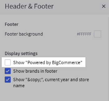
Save and Publish your changes to the storefront when you are done. Note that this setting’s location and name may vary depending on your store's theme.
How many widgets can I use?
There can be a maximum of 150 widgets per page. Page Builder uses the Widgets API, which has a total limit of 100,000 widgets per store.
Are widgets currency-aware?
Yes, Product and Product Set widgets will respect the store’s default currency, as well as any currency selected by shoppers. They will see pricing that reflects their active currency.
Can I use Page Builder with other pages?
Depending on your theme, some pages will have widget regions already built-in to them, so they are ready to use with Page Builder. Templates that aren’t widget-enabled by default can be edited to include widget regions. See the Widgets Tutorial in our Dev Docs for how to do this.
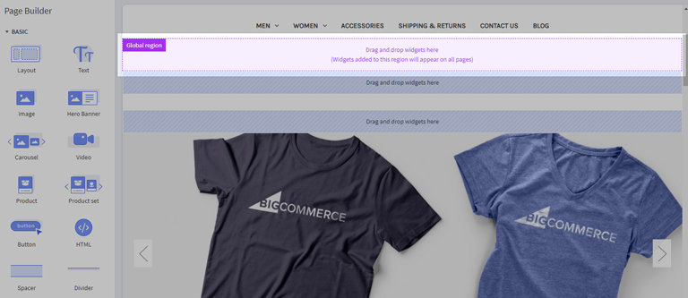
Can I add a widget that appears on multiple pages?
Yes, you can use global regions to add widgets that appear on every page that includes the same global region. In Page Builder, a Global Region appears as a purple box with a label that says "Global region".
In Cornerstone versions 4.11 and higher, there is a single, default global region that is included on every page except checkout. It is located just below the category menu/navigation.
Other themes support global regions but may vary in number and pages they're included on; check the theme's documentation or with its developer for details.
See the section for Regions in our Dev Center documentation for more information on adding and removing global regions in theme templates.
Do I have other payment options for Payment Buttons in addition to PayPal?
Yes, you have the option to use Venmo as well. Shoppers viewing your store will only see Venmo as an available option when they are viewing your store on a device with Venmo installed, and you have enabled it in the BigCommerce control panel if you are using PayPal or PayPal powered by Braintree.
What are widget updates?
When a widget has an update that could change how it works or shows up on the storefront, an update notification in Page Builder allows you to "opt-in" to the widget and preview it in Page Builder before actually applying it. This applies to both native and custom widgets.
To preview a widget update, click the Update button for the widget in Page Builder. You can then use the preview window to see how the updated widget will affect your storefront. If you are satisfied and want to keep the changes, you can click Save or Publish to confirm the update.
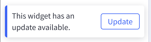
If you don't want to update the widget, you can click Discard. The update notification will continue to show on the widget until enabled then saved.
 © Copyright 2003 - 2024 BigCommerce Pty. Ltd. Shopping Cart Software